NEST BY TAMARA'S WHY IN DESIGN column: The significance of the color RED in our interiors.

great use of the color red: design by Albert Hadley
“In almost all primitive religions the worship of the Sun was always placed in the foreground. The Sun was and is "farther" than the sky, and, more importantly, it is the life-giving force which makes everything grow, gives warmth without which everything would wither away and eventually die”.
Squiddo

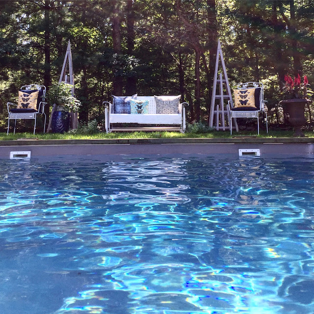
my beach cottage we recently painted the door red to welcome guests
Friday's WHY IN DESIGN:
Let's talk about the color red
I have not written about color yet in this fun, WHY IN DESIGN column, but
how important is color when designing? I feel it is one of the key elements when decorating, and it sets the mood. Blue is soothing and one of my very favorite colors to highlight when designing a home, especially when I yearn for a harmonious quiet space, so for bedrooms I often choose blue tones. Green is another favorite and when set against other colors green can shine, and depending upon when used in pale (like mint) or deep (like Emerald) it can have wildly different influences, however, it does almost always feel of the earth to me. Pale pale pink is another favorite and I love it when paired with chocolate brown as the brown neutralizes pink's frilly side and together they make a tailored fit. Grey is another big favorite and such a fabulous neural yet it's hearty, and so is it's cousin navy. But, what about red. Red is the color of power so how do we work that into a home? Men are told to wear red ties to a job interview to portray their leadership qualities. In some countries red signifies fertility while others it is s sign of dominance and power. How do we bring this strong, forceful yet awe-inspiring color into our interiors in a way that works? It is known that the color stimulates us, increasing our enthusiasm and confidence, while providing a feeling of protection from danger.
Red is a powerful color indeed. For me, red can be great when used in small doses in the form of an accent color when set against other colors. In my beach house red is the perfect and only true accent color in many of the rooms. When set against my cool grey walls, white wainscoting and blue, yellow upholstery the red accents make the room feel finished. The red makes the room pop. The red against the baby blue somehow feels nautical. Red is the chameleon of colors in a sense and put it next to black and it feels exotic. Combine red and white together in a room and it feels fresh. Pink and red together sing and somehow the pink softens red's hard edge. Red seems to be on the tip of everyone's design tongue lately, and last fall at Highpoint, Alexa Hampton highlighted the color in a big manner with her furniture collection at Hickory Chair showroom.
Let's talk about the color red
I have not written about color yet in this fun, WHY IN DESIGN column, but
how important is color when designing? I feel it is one of the key elements when decorating, and it sets the mood. Blue is soothing and one of my very favorite colors to highlight when designing a home, especially when I yearn for a harmonious quiet space, so for bedrooms I often choose blue tones. Green is another favorite and when set against other colors green can shine, and depending upon when used in pale (like mint) or deep (like Emerald) it can have wildly different influences, however, it does almost always feel of the earth to me. Pale pale pink is another favorite and I love it when paired with chocolate brown as the brown neutralizes pink's frilly side and together they make a tailored fit. Grey is another big favorite and such a fabulous neural yet it's hearty, and so is it's cousin navy. But, what about red. Red is the color of power so how do we work that into a home? Men are told to wear red ties to a job interview to portray their leadership qualities. In some countries red signifies fertility while others it is s sign of dominance and power. How do we bring this strong, forceful yet awe-inspiring color into our interiors in a way that works? It is known that the color stimulates us, increasing our enthusiasm and confidence, while providing a feeling of protection from danger.
 |
using red as an accent color works for me in many of my design projects - I used a vintage painted red caned chair with red and white toile to this small foyer
|

"It's exciting and it has a historical reference: the Greek vases, the palace at Knossos, and all that business. I love red, always have, always will. Either you like steak or you like hamburgers." -David Easton
Pictured, Farrow & Ball's Blazer 212
excerpt from House Beautiful story on the a collection of designer's favorite reds

Alexa Hampton's use of red at the Hickory Chair showroom
at Highpoint Furniture Market

Alexa Hampton's use of red at the Hickory Chair showroom
at Highpoint Furniture Market
Words that come to mind when we see the color red are love, celebration, power, religions, honor and the color red has been used in interiors
for hundreds and hundreds of years. It has been used
throughout history in various cultures since the beginning of
civilization. India adorned the
foreheads with the red dot to signify good luck, the English decorate their
streets with the famous red telephone booths, and in Soviet Union, China and
Japan the color holds powerful symbols in their flag, martial arts and in
art.
It is no wonder the color represents love. There have even been medicinal values to the
color and red has been used to treat migraine headaches in different medical
practices.
Some of my favorite uses of red torn from the magazine page archives...


photograph courtesy of New York Magazine: George Lange photographer
check out this article in New York magazine in 2004 about Albert Hadley and his relationship with Brooke Astor
I will always remember this Red closet in Architectural Digest in 2011 of Tiffany & Co.'s accessory designer, Richard Lambertson's wonderful NYC closet utilizing Farrow & Balls' Rectory Red color.

It is not hard to find red interiors designed by one of the world's greatest designers, Albert Hadley. He loved to use red in his interiors. Remember the famous NYC library Hadley designed for society maven, Brooke Astor. Hadley had the library walls lacquered this rich, gorgeous red

ElleDecor magazine
Happy Nesting XO