Sneak Peek of the 2013 Hampton Designer Showhouse: Part 1 - Nest by Tamara favorites
2013 Hampton Designer Showhouse
to benefit Southampton hospital
990 Brick Kiln Road, Bridgehampton, NY
hamptondesignershowhouse.com
to benefit Southampton hospital
990 Brick Kiln Road, Bridgehampton, NY
hamptondesignershowhouse.com
As you may know the annual Hampton Designer Showhouse made it's debut in Bridgehampton last evening. The opening gala and press preview was set on a steamy hot summer night. I am over the moon happy with this year's house, which seems as if all the designers coordinated because the house design flows smoothly from room to room and the end product is a cohesive design plan that works well together. I noted lots of textured wallpaper, much color but often in muted tones, a good amount of detail in each space yet subtle and woven together with lots of layering of textures.
Come take a look at some of my favorites:
we wouldn't expect anything less than stellar food
and fabulous people watching.
There was a great turn out of talented professionals from the industry.
a great moment and collection of the house's designers
convening for a photograph on the staircase
Who were my favorites, and why?
Patricia Fisher's Keeping Room
The sitting area just off the kitchen worked seamlessly with the downstairs decor and coloring. The green, grey and cool accessories were a perfect flattering compliment to the kitchen's similar designs. Patricia accessorizes beautifully with chunky decorative dice, a beautiful bowl of sea urchin shells and gorgeous tray and bar area. The table overlooking the pool and patio is fresh and inviting. Fisher made large over sized pillows in beautiful color combinations as well. The fabrics, rug and furniture selections are perfectly balanced, and I immediately noticed the custom rug from Doris Leslie Blau which carries the shapes used in the fabrics and pieces into the rug.
Kitchen by Bakes and Company
I had the pleasure to ride the shuttle bus with Robert and chat about his overall kitchen design. Bakes described his use of subtle layering of color and textures to create a beautiful cook's kitchen. High end yet comfortable, the kitchen is gorgeous 
two different counter tops:
a thick quartz in the center island and a complimenting Caesarstone counter top in the other areas adds to the kitchen's charm and layering with neutrals and color. Bakes' custom designed hardware adds a delicious element to the finished cabinetry -- I absolutely love the chrome edging. Bakes used the best materials and appliances in the market. Having attended both Sub-Zero and Wolf cooking school I can tell you these appliances are high-end and gorgeous, and made for the real home cook.

accessories and tabletop items from English Country Antiques.

a delightful sink and faucet combination in the bar
and set into this quartz counter top it is beautiful!
Sherrill Canet's Family Room
utilizes a plethora of Pearson textiles and furniture
and debuts her own wallpaper

designer Sherrill Canet
with Jennifer McConnell (marketing and design guru at Pearson),
with Pearson's New York Design Center showroom manager

the Stark carpet adds another layer of pattern to the space
and works well with the overall plan
Pearson just keeps getting better and better. The fabrics and furniture are rich and that hot pink/black and white fabric makes this space pop, set against a wonderful medley of neutrals with rich detailing.
again, it seems many of the designers used a neutral palette then added layers of color and textures to compliment. Canet's oversized tufted sofa adds to the room's charm and helpt to bring down it's large scale.
Barbara Page's Upstairs Rear Bedroom
was inspired by her teen daughter.
The space is sentimental, youthful, sophisticated and stylish.
With her daughter CeCe leaving the "nest" and off to college in a few weeks,
Barbara tapped into CeCe's style as inspiration for the bedroom's design.
I caught this candid of Cece posing in her bedroom.
I am certain she would love to take this design off to her college dorm!
Duralee fabrics, a rich mirror from Mecox Gardens, Arterior lighting, incredible custom thread bedding and silk taffeta curtains that feel like a ballgown all add to the room's beauty.
Celerie Kemble's Master Bedroom
I am completely smitten with Celerie Kemble's bedroom.
Kemble's room is an perfect example of beautiful design.
At every turn I discovered small fine details.
Using her finely tuned eye, Kemble brings an exquisite space to light using her own collection of furniture from Henredon (that bed!) and Maitland-Smith, her fabrics for F. Schumacher, and that wallpaper of hers that anchors the space.

this atrium ceiling is beautiful in this special blue color and offsets the room's wonderful combinations of neutral colors
good design is all in the details that come together in a symphony of sorts, and resulting in a beautiful picture that functions. This fabric trimmed with the wooden beads and offset with the rustic shade adds an earthy combination to the gorgeous teal blue painted atrium ceiling in the sitting area alcove of the bedroom.
the lamp, bed, bedding, wallpaper -- well, it all works and is simply divine!
The master bedroom was a homage to much of Kemble's collections,
and she finished the details nicely with this pair of chairs covered in a classic Schumacher black and white floral fabric, which was once a favorite of designer Albert Hadley
Keith Baltimore's upstairs Front Bedroom
is fresh and modern

Baltimore interjects beautiful art and sculpture into his room and this white fabric (the curtains) makes me think of pretty summer dresses, and set against the modern decor it all works very well.
I love it when the designers bring a local focus to their spaces. Baltimore used local design favorite Jack Lenor Larson's wallpaper inspired by his East Hampton retreat at
Longhouse Reserve
Lillian August's swanky dining room
lures you in as you enter the home. Set just off the entry hallway there is a great use of colors and a little bit of bling with a luxurious overhead chandelier
design and marketing talent, Skye Kirby Westcott from Lillian August described to me the entire room's inspiration came from the fabulous Romo Black edition fabric they used to make chunky, beautiful curtains in the apple green/teal blue cool space. The green seagrass covered walls set a festive tone, and when combined with blue, white and a little bit of glitter the room is glamorous and very "Hampton" style.
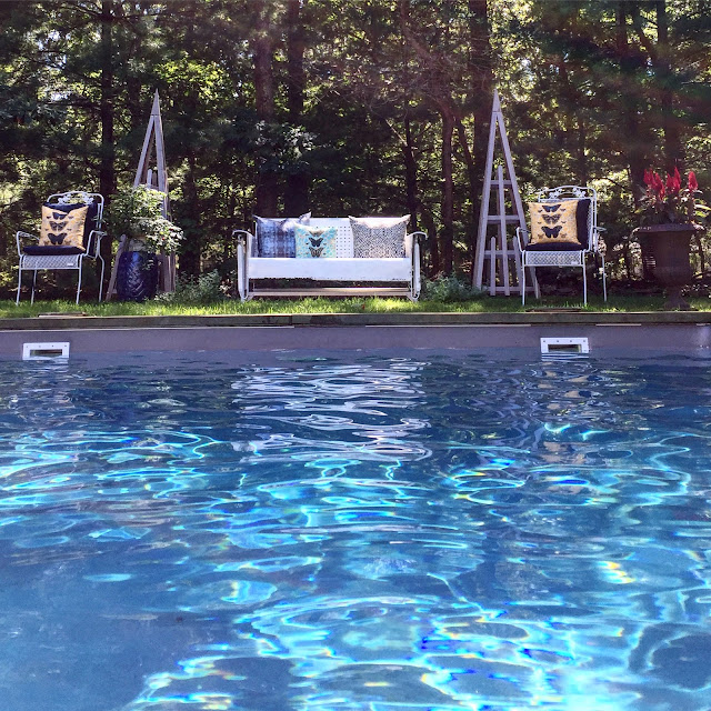
I caught up with the ladies from outdoor furniture company, Gloster as we enjoyed the beautiful backyard views overlooking the pool and tennis court. Gloster provided many outdoor pieces upholstered with their outdoor fabric collection throughout the pool and patio area.

Please stop back on Friday
for more glimpses of the showhouse
Happy Nesting XO


