Nest by Tamara's WHY IN DESIGN column: the value and history of using toile fabrics in a home


blue toile entices- photo via Traditional Home
TOILE DU JOUY
French reproduction toile 1830 at Winterhur
Friday's Why In Design column:
Let's start today with a look at
Toile du Jouy
in French,
toile means "cloth"

Toile de Jouy
"sometimes abbreviated to simply "toile", it is a type of decorating pattern consisting of a white or off-white background on which a repeated pattern depicting a fairly complex scene, generally of a pastoral theme such as a couple having a picnic by a lake or an arrangement of flowers.] The pattern portion consists of a single color, most often black, dark red, or blue. Greens, browns, and magenta toile patterns are less common, but not unheard of. Toile is most associated with fabrics (curtains and upholstery in particular, especially chintz), though toile wallpaper is also popular." Wikipedia
A little history of Toile-
Toile was originally created with a copper plate process and printed on cotton. There are reports of toile in Ireland in the 1700s, but much is known about the making of toile by 1760 in France, and the using it to decorate in homes became popular during the 18th Century in both England and France. The name toile can be traced to a small town near Versailles called Jouy en Josas where it was created. The use of toile in decorating here in the States has had surges of popularity over the years, notably in Colonial times in America, and again in the 1930s, and again in the 1970 with the bicentennial then again 1980s with the popularity of Chintz (Thank You Mario Buatta, Prince of Chintz). I equate toile with the French countryside, and those pretty pastoral or farm scenes with maidens milking cows in a repeat pattern adorning the fabric. Decorating with toile transforms me to the lavender fields of France, and inspires me want to hop on an airplane to Provence. Usually printed on cotton or linen, but for a more sophisticated appearance on cotton chintz, toile is a lovely way to tell a story about lifestyle- a country scene, the people who live there and their everyday life, or even their fantasy life. Sometimes the toile shows different cultures, like the ever-popular Chinese toile scenes. Toile can show us history and culture with a single glance. It's soothing and beautiful and when used well in a home can add charm and sophistication. |
American Toile- In the 19th century roller printing procedures replaced the copper place technique and made it more readily available, and soon Americans began creating their own versions of toile, which were mostly depicted 18th century European lifestyles. What differentiates a traditional French toile with music lyres and ladies carrying parasols or farm animal scenery from an American one? sometimes they are the same and reproduced but with a more loose sketch to the pattern, and maybe unusual colors and combinations. I like to say that Americans are the masters of re-invention and re-interpretation. We took many of these classic French and English scenes then added our own twist and made it our own. American toile has been incredibly popular over the years. Toile fabric had an important role in identifying our own design style and our overall identity in the Colonial times when we were building our nation, establishing our identity and independence from England. These toiles from that era can be an almost text book story of our American history.

one of the French "Four Seasons"
re-worked depicting daily life rituals in France
 Want to work with toile but afraid it will look too frumpy? for a contemporary feel add a little bit of the pattern to a room and then mix it up with other designs- such as this geometric with a floral pillow from Jane Churchill's collection in front of the toile drape.
|


one of my most favorite toiles is from Brunschwig & Fils,
the West Indies toile. I prefer the blue and white color because it feels both modern and traditional.

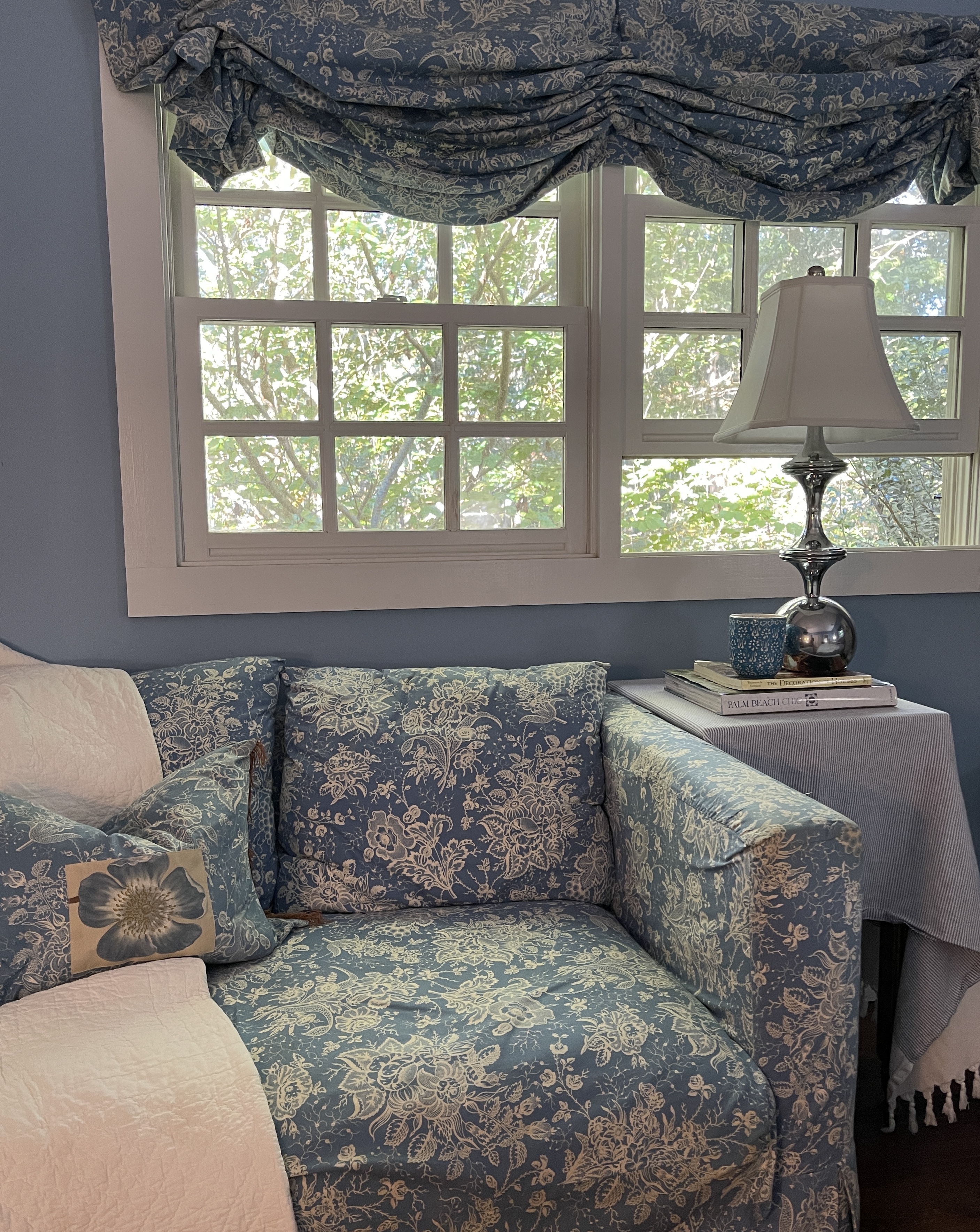
I love blue and white toile....why?
Blues are soothing and not as harsh as other colors when used repeatedly. As a matter of fact, I'm with good old, Henry Francis du Pont. Du Pont was way ahead of his time as a gardener, collector of Americana, decorator and head creative behind making the Wintethur Museum what it is today (and, by the way did you know Henry du Pont was asked by Jackie O to help advise with her decorator on the antiques and art for the White House?). See above du Pont's color genius in combining hues in the Queen Anne dining room for a New Hampshire client in the 18th century. Du Pont believed color was one of the most important features when decorating (his color sense is illustrated in his designs at the dreamy Beauport Museum in Gloucester, Massachusetts owned by his friend Henry Sleeper). Du Pont advised Sleeper on the renovations and designs of the Beauport Museum and much of the glass collections and colors. This dining room for a New Hampshire home is shown at the Winterthur Museum, and isn't that blue toile just punchy, and well, timeless and almost modern in approach set against that pale washed green woodwork?
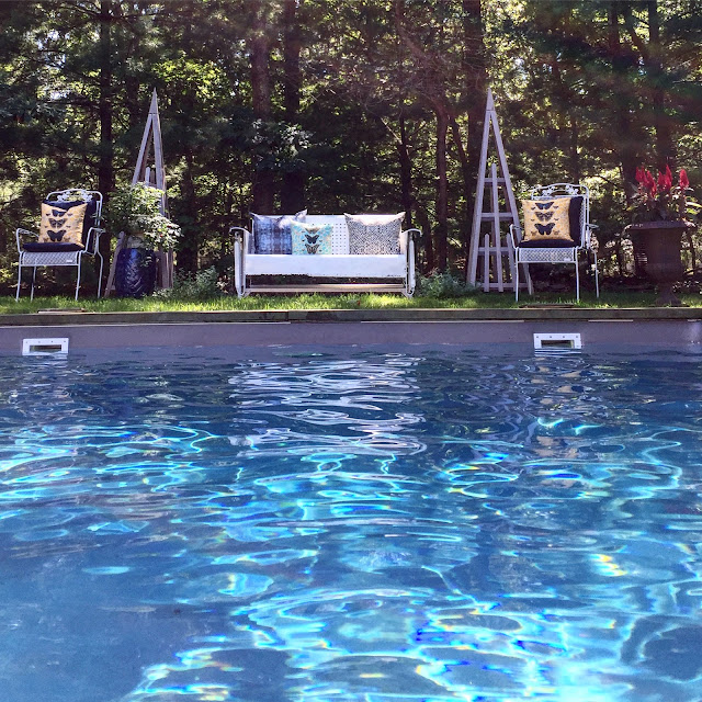
blue & white toile I used in a
beach cottage master bedroom and bath.
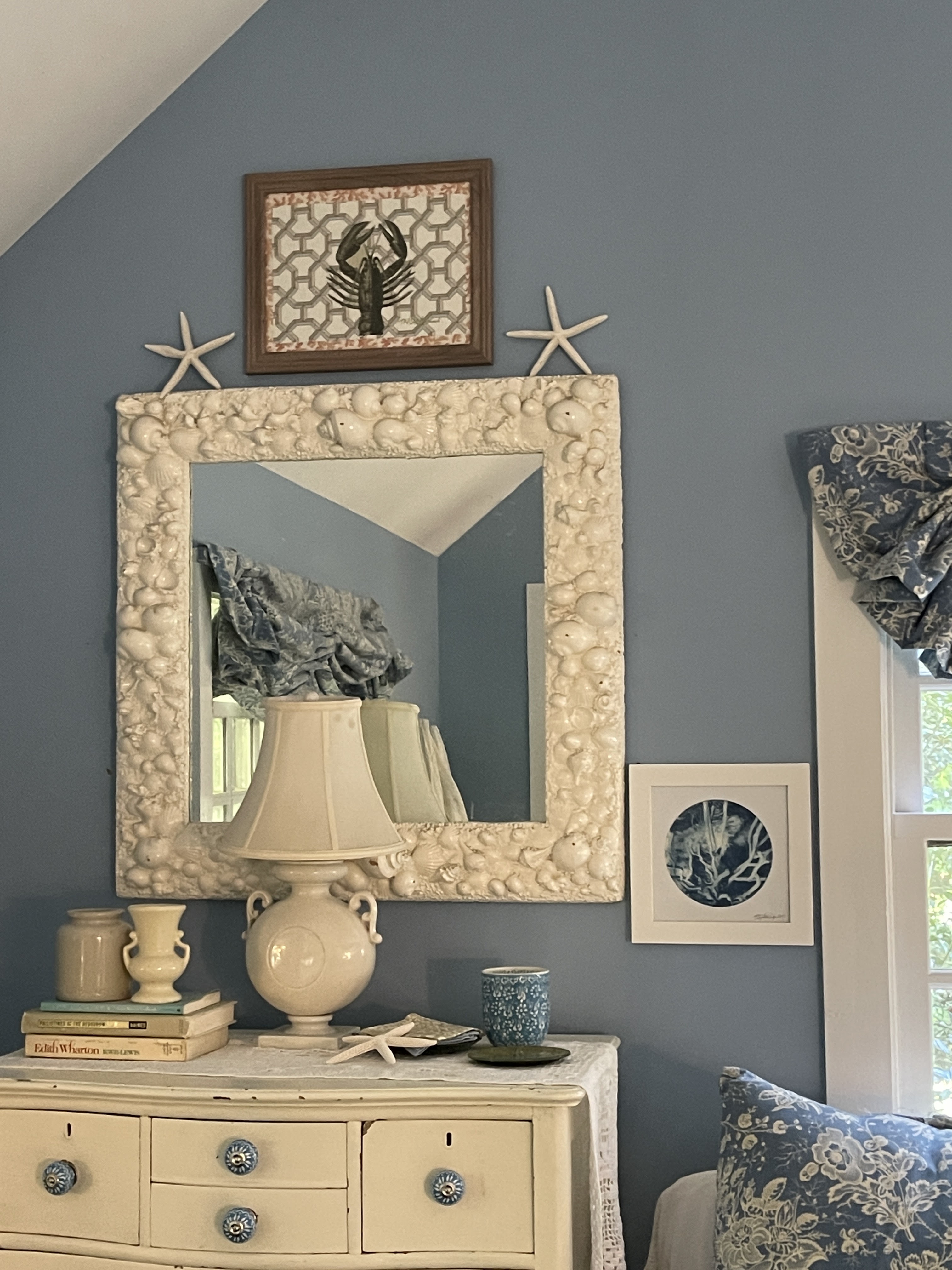
It can be too busy but when used in the one color version and repeated in a space as the singular fabric in a room, it can have a soothing effect. When it comes to toile as the only fabric choice in a space, I say more is better. In other words, use it repeatedly in a room to get the most dramatic impact. I used it in to create a beach house master bedroom and bathroom with a Hinson seagrass wall cover in the bathroom, and alternating a plain, white cotton twill with the toile to give an interesting appearance and a simple, beach aesthetic.
When I decorated this cottage, I wanted a relaxed feel so I chose a simple, yet unusual toile with a blue background and white flower pattern (reverse of the normal toiles) in a simple, light cotton from French fabric maker, Brunschwig & Fils. This pattern gives off a more country feeling, but has a sophisticated aesthetic, not with animals or country scenes but with rustic sprigs of flowers and grapes cascading along the drape. I designed a floppy roman shade for the windows and in the bathroom made similar ones with white cotton canvas and the same toile as large borders, then designed a shower curtain in the same canvas/toile combination, and tufted the seat on the bathroom bench and on the dressing table in the toile. I slipcovered a small pull-out chair and created four large European size bed pillows. The end result is the room feels timeless and serene. The end result is the room feels timeless, sophisticated and serene. the vibrant colored blue painted walls are a perfect beach-like feel.
 Colefax & Fowler  |

These two are some of my favorites because they are almost modern in feel, timeless yet classic... Colefax & Fowler and Manuel Canovas "get" modern design, and utilizes old world patterns but injects bold and unusual color combinations for a modern French feel. So, go on and add a little sense of history to your home and start small, maybe with a throw or lumbar pillow, then work your way from there. Each time you glance at your toile you'll remember the past, while bringing it into your home adding a modern twist. |
Happy Nesting
XO Tamara
sources:
ehow.com